In the continuing exploration of UI patterns for AI augmentation, this second article delves deeper into specific methods that empower users to seamlessly generate results using artificial intelligence. Just as we discussed in Part I, the integration of AI into everyday tools can transform user experiences, making interactions with technology more intuitive and efficient.
Have specific ways that permit users to generate results with AI
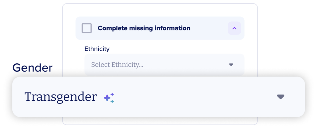
Auto Fill: simplify how users extend prompts across multiple inputs, enhancing efficiency.
This feature, commonly seen in tools like Excel, demonstrates AI’s ability to automate mundane tasks, thus saving valuable time. This is particularly impactful for large-scale data operations, offering users not just automation but meaningful connections to previously inaccessible information.
Employing Auto Fill as a method of input simplifies the process of linking everyday tasks with the benefits offered by the model, thereby streamlining user workflows and improving the overall ease of life.
⚠️ Heads Up!
There’s a higher likelihood of individuals sharing personal or proprietary information through spreadsheets rather than via open-ended prompts. This explains why major corporations impose restrictions on their employees regarding the dissemination of such data to public large language models. The security ramifications of this feature must be carefully considered.
💡Check this example: Alvee

Open chat: open-ended prompt inputs that can be used in dialogues or to refine results
The “Open Text” pattern has emerged as a fundamental element in interactive AI design, promoting conversation between users and AI systems. It is distinguished by its straightforward and user-friendly interface, which encourages users to engage with the underlying model.
A key advantage of this approach is its ability to cater to a broad range of user intentions and inquiries, meeting various needs and preferences. This versatility improves the user experience by delivering tailored responses and solutions.
⚠️ Heads Up!
The extensive openness of the interface may sometimes be daunting for users, particularly for those who are not well-acquainted with the AI’s capabilities or prefer more direction. In the absence of explicit prompts or examples, users may find it challenging to start a dialogue or clearly express their requirements. Moreover, natural language is intrinsically vague. Lacking structured input, users may frame their questions in ways that lead to misunderstandings by the AI, resulting in responses that are either irrelevant or unsatisfactory. Such experiences can lead to user frustration and diminish trust in the system.
💡Check this example: Arionkoder’s Customer Portal

Remix / Blend: merge prompts or integrate them with different sources to generate new outcomes.
When you input a prompt or request, the model searches for tokens relevant to your query and anticipates what you seek in return. This understanding allows for the remixing of sources into fresh outputs. The model essentially utilizes other prompts, documents, images, etc., as token sources, combining them with additional text to create new results.
The “Remix or Blend” functionality finds diverse uses across various applications such as image generators, content editors, and chatbots. Users can refresh previous responses by reusing original prompts or incorporating new data.
From both a product and user experience standpoint, the ability to remix content can effectively address and overcome dead ends.
⚠️ Heads Up!
Every new piece of information introduced adds complexity to the model’s processing and increases the potential for unpredictable outcomes. Seek methods to make these processes more predictable for users. Provide mechanisms that allow them to view the refined prompts. Educate users on crafting more effective inputs, enabling you to concentrate on enhancing the quality of the model’s outputs.
💡Check this example: Alvee

Synthesis: condense or restructure complex information into a simplified structure.
As AI technologies advance, they empower individuals without a technical background to swiftly uncover relationships within large data sets that might have previously been challenging or elusive. The Synthesis prompt essentially bestows this powerful capability on the average user.
This type of prompt is commonly utilized in open canvas tools like Figjam and Miro. Additionally, the synthesis prompt is used to condense lengthy documents or aggregate multiple documents. Numerous text editing tools now include features that summarize content or highlight key points. Similarly, tools like Grain and other video processing applications provide comparable functionalities for audio files.
⚠️ Heads Up!
When applied within a canvas environment, it can be challenging to effectively communicate the limitations of AI to users. Individuals might form weak conclusions based on the synthesized data or may not adequately question the AI’s organizational logic.
💡Check this example: Infodesk

Use tools to refine your prompt or the results to get more predictable outputs
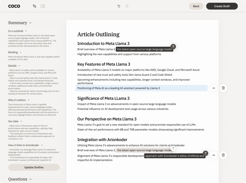
Filters / Parameters: enable users to set constraints that enhance the accuracy and relevance of their results.
The adoption curve for generative AI is formidable. As users become acquainted with how to formulate requests for the model, their next question often concerns how to optimize outcomes. Filters and parameters provide this level of control, simultaneously educating users on sophisticated prompting techniques via gradual revelation.
Parameters specifically enable users to establish limits around a model to enhance both the quality and precision of the outputs. This functionality not only renders generative AI more applicable in commercial and academic settings but also empowers users to engage with the data in a way that prioritizes human-centric interaction.
⚠️ Heads Up!
Parameters, while beneficial, remain a complex aspect of large language models (LLMs). It’s advisable to use Wayfinders to assist users in identifying appropriate parameters, or to present them as filters from the outset, similar to the approach in the Perplexity interface. Avoid assuming that users will intuitively grasp how this sophisticated feature functions.
💡Check this example: Coco

Model management: allow users to choose the specific model they wish to use for their prompts.
Giving something the ability to see and shape the operational stuff behind the scenes can help them become more advanced users of the tool. By exploring how different models affect their results, users can learn to tune their results to get predictable results across models, or take advantage of differences within them.
By allowing users the ability to change their model, or even eventually upload their own, you will learn things about your own software interface that you couldn’t easily uncover with this scale of use. Converting users into co-owners of the model through feedback and prompt results improves the model overall.
⚠️ Heads Up!
Availability does not absolve the provider of responsibility for outcomes. If you enable users to switch between models, ensure it’s clear which model they are using. If feasible, explain the differences between the models so users can anticipate how this choice might affect their experience.
Personal voice: guarantee that outputs consistently align with your established voice, tone, and preferences.
For professional use of AI tools, it’s essential that users trust the outputs to be configurable and consistently reflect their own quality standards. This includes maintaining a consistent tone of voice, suitable for both individual users and brands. It also involves the ability to reuse specific parameters or inputs in prompts without the need to repeatedly enter the same information. This consistency and configurability are crucial for integrating AI tools seamlessly into professional environments.
⚠️ Heads Up!
Your voice and tone are crafted by human effort, tailored to add specific value to you or your business. Replacing this human touch with a computer that approximates but doesn’t perfectly emulate human nuances introduces ethical dilemmas. Moreover, writing can fall into the Uncanny Valley, where it sounds almost but not quite human, creating a sense of discomfort. While technological settings can enhance the polishing of final drafts, they are not meant to substitute the unique contributions of human writers.
💡Check this example: Coco

Let users control the response and assess its accuracy
Caveats: alert users to potential limitations and risks associated with the model or the technology as a whole.
How do we promote responsible use of an emerging technology? Users come from diverse technical backgrounds, and their understanding of the limitations of generative AI, ethical considerations, and how to interpret results responsibly can differ greatly.
For users who are less technically inclined or younger, providing clear caveats acts as a straightforward method to communicate the limitations of the technology. This approach is akin to placing a warning label on a hair dryer advising against its use in the bath, serving as a simple but effective reminder of how to use the product safely.
⚠️ Heads Up!
As models are refined, numerous unforeseen factors can affect a user’s interaction with the technology. Simply adding a caveat doesn’t absolve the responsibility of those providing the technology.
Moreover, caveats should be seen as temporary fixes, not permanent solutions to ensure thoughtful user experiences. There’s an ethical obligation for companies to carefully consider how to promote responsible usage and accurate interpretation of the content they provide, ensuring that these measures are substantive and not merely superficial.
💡Check this example: Infodesk

Controls: regulate the flow of information or temporarily halt a request to modify the prompt as needed.
Response times can fluctuate based on the size or complexity of the request. Consequently, a standard pattern has developed, enabling users to manage the output directly.
The most widely used control feature is the stop icon, which lets users pause a request in progress. From a UX standpoint, this function is invaluable as it allows users to halt and adjust their prompt if the initial results do not meet their expectations, thereby saving time and enhancing user satisfaction.
⚠️ Heads Up!
Users may become frustrated if they pause a prompt and then restart it, expecting to receive a similar result. Variations in processing can lead to the second response being significantly different from the first, which can be confusing and disorienting.
💡Check this example: Coco

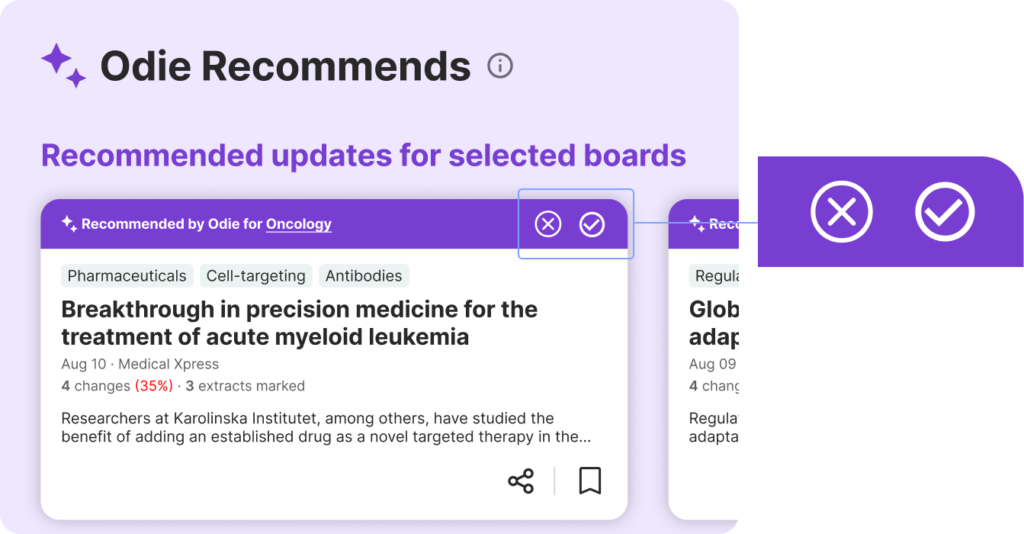
Feedback: Highlight gaps in expectations or errors in the model—but, is it clear to the user?
Enabling users to rate their interactions is now a fundamental aspect of service and conversational experiences. The use of thumbs up/down or star ratings is quite standardized across the board, with only minor variations.
However, what we should anticipate, or at least hope for, is an increase in the clarity and detail regarding the impact of user ratings. It’s important for users to understand whether their ratings pertain to the specific responses to their requests or to the overall performance of the model. Such transparency is crucial as it provides engineers and designers with immediate feedback on how the model might be underperforming or failing to achieve its intended outcomes.
⚠️ Heads Up!
If no additional affordance is provided to improve the user’s experience, companies are collecting user data with no immediate or cathartic value returned in exchange [“if the service is free, you are the product”]. Avoid this by offering suggestions to the user for how to get better results, or teach them how to improve their results by giving their feedback directly to the bot.
💡Check this example: Infodesk

Footprints: allow users to trace the connections between sources and outcomes, providing a clearer understanding of how results are derived.
Working with generative AI might sometimes resemble navigating a dark maze. Even as you begin to find your path, the route you took can be unclear.
The term “Footprints” describes various emerging patterns that enable the tracing of connections between sources and outcomes across diverse requests and results. This helps illuminate parts of the journey through the AI’s decision-making process. However, it’s important to acknowledge our limitations—we don’t know what we don’t see. There are still traces and data influences hidden because our current technology and methodologies are not yet capable of revealing them. This understanding is crucial as we continue to evolve and improve our interactions with AI systems.
⚠️ Heads Up!
When an AI provides sources, it might inadvertently create a cognitive bias, leading someone to believe they are getting a complete overview when, in reality, additional information might have been either intentionally or unintentionally omitted by the model. This is particularly significant in scenarios where the user relies on the AI’s response to form opinions or understandings.
💡Check this example: Coco

Conclusion
As we continue to navigate the evolving landscape of AI, it’s clear that designing for AI is still in its early stages. This series does not aim to be a comprehensive guide but rather a sharing of insights gained from our ongoing experiments and learnings. We hope these discussions will serve as a springboard for further exploration and innovation in the field of AI-enhanced design.
For those looking to dive deeper, resources such as the guidebook from PAIR and the Shape of AI patterns library provide valuable frameworks and considerations for crafting effective AI user interfaces.
By embracing these emerging UI patterns, designers can play a pivotal role in shaping how users interact with AI technologies, ultimately making these tools more intuitive and empowering for everyone.
Reach out to us at [email protected] and together, let’s design the future of your AI product.
