
As ML & AI become increasingly common in product design, it’s relevant to review both existing and new UI Patterns and understand how they can be utilized to build great AI products focused on user interaction.
Although artificial intelligence has been in development for a long time, the last year and a half has witnessed a true revolution. Nowadays, a vast number of companies have adopted or are about to incorporate AI models into their products. With this in mind, we, as designers, must prepare users for change—and help them understand how to train the system.
Here are some keys for designing interfaces for AI Products:
Help users identify and distinguish AI features and content
To understand this point, it’s important to address the topic of mental models: A mental model is a person’s understanding of how something works and how their actions affect it. People form mental models for everything they interact with. Mental models help set expectations for what a product can and can’t do and the kind of value people can expect to receive from it. Artificial intelligence operates differently from traditional software, as it involves learning from data and adapting to the user through time. This distinctive approach is why our users must recognize where and how we are using AI. To achieve this, some of the UI Patterns that can help us include:
Color scheme: Visual cues to help users identify AI features of content
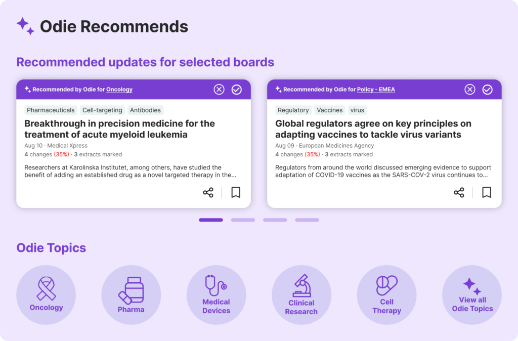
The use of color has proven to be an effective marker for identifying AI-enhanced products and features. Although there isn’t a standardized color palette, this trend is expected to develop further as standout products begin to distinguish themselves from others. Where there is a degree of uniformity, two colors stand out: purple and green.
Purple tends to be the more prevalent of the two, appearing in the majority of products that feature AI capabilities. Since the entire market seems to be catching onto the purple trend, using it to distinguish your product or feature is a safe way to signal the technology you’re using.
⚠️ Heads Up!
But, be careful, if everyone uses the same color, if every product adopts the same color, it might become challenging for consumers to distinguish one product from another. If you want to stand out, consider playing with other colors while relying on alternative indicators of AI presence.
Additionally, it’s also important to note that color by itself often does not provide enough guidance due to variations in users’ physical or cognitive abilities, such as color blindness. Combine color with text-based or iconographic indicators to help users navigate information by source and type.
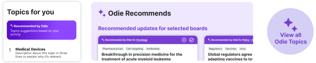
💡Check this example:
Infodesk
Iconography: Images that convey the form the AI takes in a product
It appears that the sparkly stars icon has become ubiquitous as a symbol of AI’s involvement, yet the iconographic vocabulary for AI is coalescing around three primary metaphors:
✨ Sparkly stars are commonly used to denote AI features and to mark content that has been created or enhanced by AI.
🔮 A glowing orb is often seen representing text or chat interfaces.
🤖 Robots are typically employed in a literal sense to depict bots or agents
Consistent iconography leads to predictability and trust by users and consumers.
⚠️ Heads Up!
The sparkles and robot emojis also see frequent use in various other contexts. It’s important to ensure these icons are not misleading, suggesting a functionality that does not exist. Apply these symbols consistently throughout your product environment.
Having consistent icons fosters predictability and builds trust among users and consumers.
💡Check this example:
Alvee
Alvee is an AI-driven health equity data management platform that helps to Identify and measure health disparities, predict and track social needs, activate data with real-time insights, and promote health equity.
Name: How do we refer to the AI?
Users need to understand with whom or what they are interacting. In environments where users are explicitly aware they are interacting with AI, this detail may be less crucial. Imagine starting at a new company and discovering that you’re communicating with a third-party AI agent rather than a team member.
Names can help users to understand who they are speaking to. Employing iconography, a personal name, and other distinguishing markers can clarify the distinction between interacting with a bot versus a human. This approach can also facilitate smoother transitions from bot to human conversations, providing users with intuitive cues on how to engage.
⚠️ Heads Up!
Using human-like names may lead to confusion. To prevent situations where users might not realize whether they are conversing with a bot or a human, incorporate additional indicators within the interface. With this strategy, you might also consider utilizing a different UI pattern to signify the presence of AI.
💡Check this example:
Infodesk:
Give clues to help users understand how the AI works
Given that AI systems operate on principles of probability and uncertainty, providing an appropriate level of explanation is crucial for users to comprehend how these systems work. By developing a clear understanding of the system’s potential and limitations, users can better gauge when and how to rely on the technology to achieve their objectives.
Nudges: Alert users to actions they can take to use AI in their existing tools
Nudges use progressive disclosure to help users identify AI and use its capabilities in ways they didn’t know existed. They also facilitate the return to significant tasks, enabling easier access in future interactions.
It’s crucial to elucidate AI-driven predictions, recommendations, and outputs to users to build trust.
The best time to teach someone is when your assistance can help them achieve a goal they are actively striving towards. Features like nudges help individuals grasp the technology by applying it to tasks they are already engaged in.
⚠️ Heads Up!
It’s not necessary to demonstrate every capability to someone during their initial interaction. Ensure that the actions you suggest through nudges do not result in dead ends. Think about implementing guardrails to guarantee that users access certain features only after they’ve reached essential thresholds or pivotal moments. These guardrails could be subtle, or consider ways to make them more engaging, perhaps through gamification. Keep in mind: the purpose of AI is to assist, not merely to impress
💡Check this example:
Alvee:
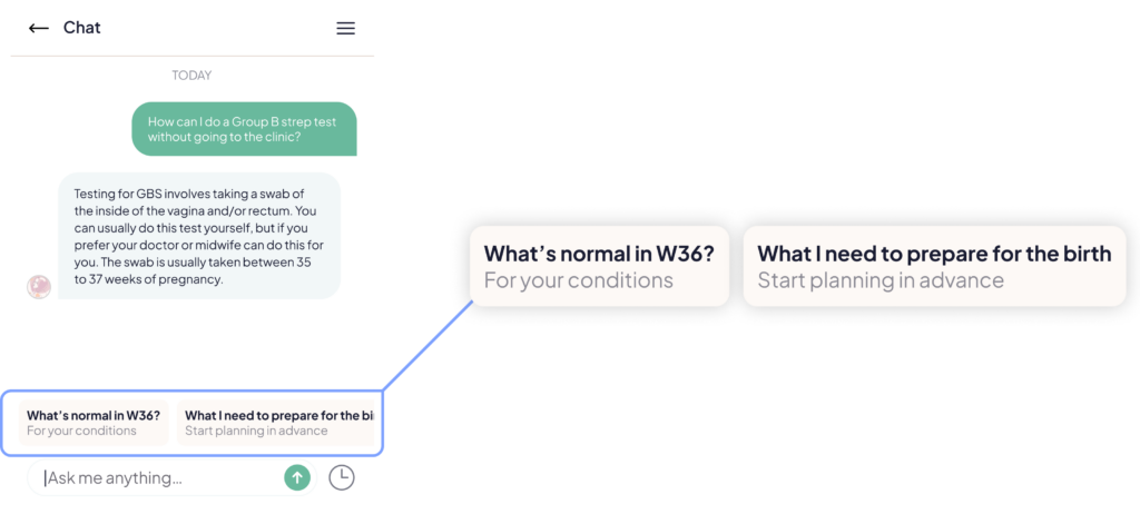
Suggestions: Solves the blank canvas dilemma with clues for how to prompt
To give clues of some AI capabilities, we can provide structured prompts as suggestions. These example prompts help users recognize possible questions and keep the conversation going. Usually, these suggestions appear as a list of 3-5 suggestions that automatically fill the chat box when chosen.
⚠️ Heads up!
The first interaction might feel a bit random, but follow-up interactions should tailor to the user’s preferences to stay relevant. Continuously providing unrelated suggestions can undermine the user’s experience. Think about merging these prompts with options that allow users to modify and see their preferences, or utilize insights from previous chats to improve the suggestions provided.
💡Check this example:
Gemma:
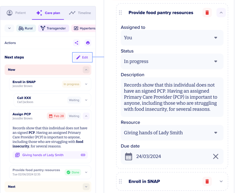
Template: Structured templates that can be completed by the user or automatically by the AI
Templates represent a particular kind of Suggested Action that provides an easy entry point into complex product features. They take the affordances of nudges or parameters and turn the knob up to 11.
⚠️ Heads Up!
It’s not necessary to display all features at the first interaction. Make sure that the actions proposed through these templates avoid leading to unproductive results or dead ends.
💡Check this example:
Alvee:
In conclusion, designing UI for AI-augmented products requires a deep understanding of both technology and human behavior. By carefully crafting cues, such as color schemes, iconography, names, and interactive prompts, we can guide users smoothly into this new era of interactions with AIs. Our goal is not only to enhance user experience but also to foster an environment where technology serves as a reliable and intuitive extension of human capabilities. For this, it’s also important that users don’t automatically trust your AI system under all conditions; instead, they should adjust their trust appropriately.
Stay tuned for part II of this post, to be released soon!