Our digital product design company strives to create products that not only operate seamlessly but also offer an enjoyable user experience that sets our creations apart. To achieve this, we employ Nielsen’s 10 Heuristics. Learn more about them here, and let’s dive into the third heuristic: User Control and Freedom.
At least once while navigating a new digital product, everyone has had one of those moments where we think “Oh, oops! I shouldn’t have clicked on that button, where is this thing taking me?”. And most of the time, it’s followed by a “How can I undo it real quick and not get too carried away?”.
Just like buildings should always have emergency exits for safety reasons, all digital products should also include them: it helps users leave unwanted states they accidentally enter, in a straightforward and timely manner. That’s the essence of Nielsen’s third heuristic:
Users often perform actions by mistake. They need a clearly marked “emergency exit” to leave the unwanted action without having to go through an extended process.
Users navigate digital products with more freedom and confidence once they realize it’s easy for them to back out of a process or undo an action they didn’t mean to do, especially when it can be done quickly. Exits help users feel in control of the system they’re using, avoiding frustrations and hassles that stem from mistakes or poor choices. Vice versa, when our digital product doesn’t support exploration users might feel restrained and disengaged.
Some popular UI controls that allow people to go back to previous system states are:
- Back link. Users can return to a previous screen or page.
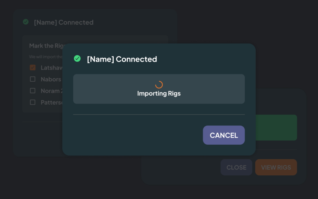
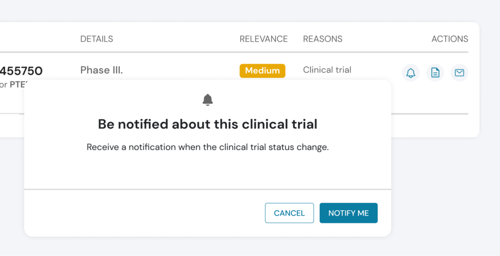
- Cancel link. Through it, users can quit a task or multi-step process.
- Close link. Allows users to close a new view.
- Undo option (accompanied by redo option) for quick backtracks.
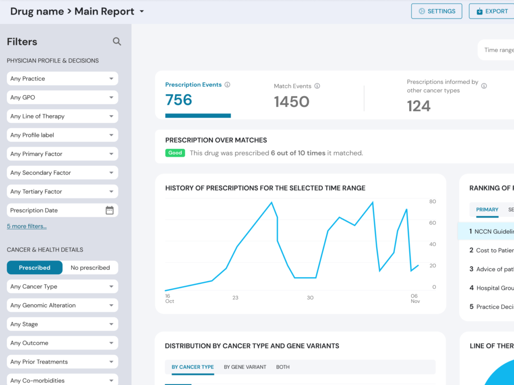
Let’s review some examples of our work at Arionkoder:


Whenever users access a new screen, page or view, they should have access to at least one of those control mechanisms. In the case of the Back link specifically, there are some considerations we should have in mind:
- Always give users the chance to go back. If you don’t make it available to them, you will have momentary hold but then quickly lose it out of exasperation.
- Some content, such as forms, can interfere with the Back link. Instead of having users frustrated and losing all their progress, consider designing forms where the Back link can be used without eliminating the user’s progress -or letting them know that the action they are about to take will do so-.
Just like physical exits, exit links should be easily discoverable and correctly signposted. One way to do so in the digital world is by using design standards when positioning Close, Exit or Cancel signs both in terms of positioning and iconography.
These ideas shape the way for human-centric, usable digital product design that is empathetic towards users and sets your offering apart.
Stay tuned for an exploration of Nielsen’s fourth heuristic: Consistency and standards, and delve into ways to reflect it in your product.
At Arionkoder, we help you create innovative products that delight your users. Reach out to us today to discover everything we can accomplish together!
