Our objective as a digital product design company is to develop products that not only perform well but also provide a satisfying user experience. We leverage Nielsen’s 10 Heuristics to achieve this. Discover more about them here, and explore heuristic number 9: Error Message Guidelines, below!
“The operation could not be completed. Error Wy5k1.”. “Sorry, your account could not be activated”. “Can’t move your file. The item was already moved or deleted, or access was denied”. How infuriating! As users of digital products (because yes, we’re all users, even if we’re also designers), seeing error messages pop up -especially those who give us no sense of direction or any clue as to how to move on- can ruin an otherwise great experience.
Errors happen and it’s not realistic to aim to eliminate them for good, but we can present them differently and with a human twist for better results. As Nielsen’s 9th heuristic puts it:
“Error messages should be expressed in plain language (no error codes), precisely indicate the problem, and constructively suggest a solution.”
Error messages have been around for over 20 years. Good error messages used to have the following characteristics:
- They indicate explicitly that something has gone wrong. We can’t have a good error message if we never get a message to begin with. Explicitly offering feedback is the first step towards fixing a situation that can potentially harm the user in the pursuit of their goals within our digital product.
- They’re human-readable. The language the messages use is clear, with no abbreviations or technical jargon.
- They’re polite. The messages don’t make the reader feel uncomfortable, or imply lack of abilities in any way.
- They’re precise. The error is described clearly, instead of using generalities that might confuse the user.
- They offer constructive advice. More than just stating the problem precisely, the error messages offer some sort of suggestion for the user’s next steps that help them find a solution.
New characteristics of good error messages
The complexity of digital products in the past few years has called for new distinctive features of error messages that complement the list above:
- They are visible and noticeable. Both the message itself and the way it indicates what must be repaired are very observable to the user.
- They preserve the user’s work. Users can fix errors by editing the original action instead of re-completing the entire process.
- They reduce the amount of work needed. Users can correct errors simply, such as when the system guesses the correct action and lets the users choose from a list of fixes.
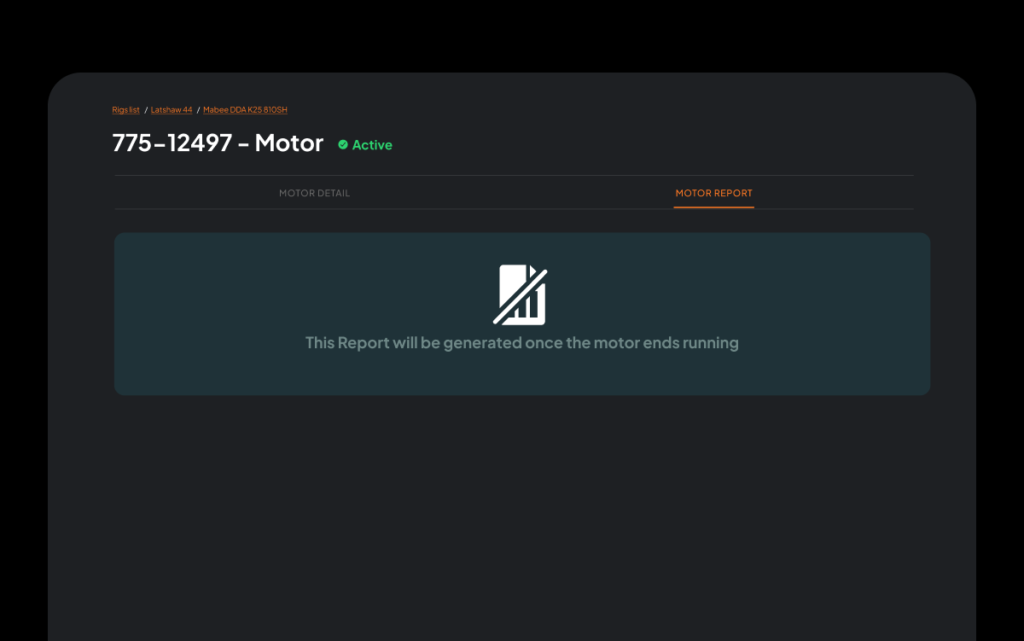
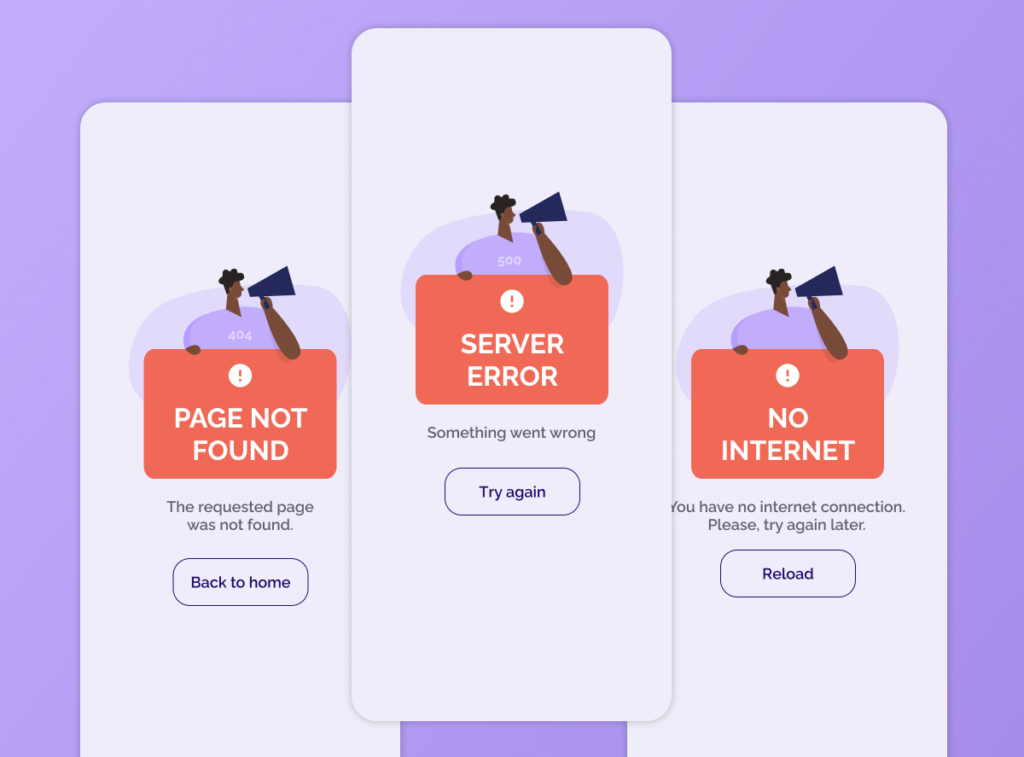
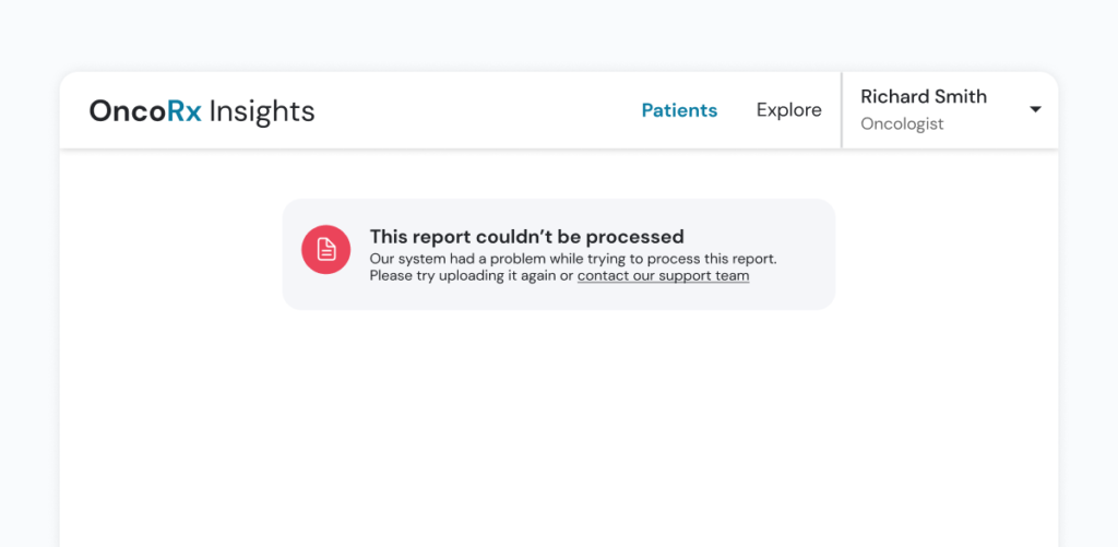
Let’s analyze some examples from our own work:


Errors are a great opportunity to educate users, who are not likely at all to read system documentation unless they are in trouble. While keeping the error message brief and to the point, we can give users information about how the system works and how to better use it. One way to do this is through hypertext links that furthers the available information to users.
Errors are not something we desire in our digital products, but when they happen it’s better to face them in a human, helpful manner that helps users recognize the situation, diagnose their position and recover from it.
Stay tuned for an exploration of Nielsen’s tenth and last heuristic: Help and documentation.
At Arionkoder, we help you create innovative products that delight your users. Reach out to us today to discover everything we can accomplish together!
