
We are a digital product design company that aims to develop products that not only perform well but also deliver a smooth and delightful user experience. To achieve this, we utilize Nielsen’s 10 Heuristics. Learn more about them here, or dive in and explore heuristic #5: Error prevention.
Digital products are often a game of numbers. The more users, operations and general information you have, the better you can fine-tune your design to help your users. Let’s say you keep noticing a repeated error amongst users of many different kinds. Is that a coincidence, or is there anything you can do to help your users avoid that error and continue their joyful use of your product?
According to Nielsen’s fifth heuristic:
“Users are often distracted from the task at hand, so prevent unconscious errors by offering suggestions, utilizing constraints, and being flexible.”
Even though this is not a blame game, it’s important to know that when users keep making a mistake, it’s probably not user error in the sense that the user is at fault, but rather a designer error: we’ve made it too easy for the user to make the wrong decision. And instead of scolding users, we should put our energy into redesigning a less error-inducing system.
There are two main types of errors that users can make: slips and mistakes.
- Slips happen when users intend to do one action, but end up doing another action that is usually similar -think of a typo-. It happens usually when users are not paying their full attention to the task at hand.
- Mistakes are the result of users who believe that one action is connected to one result when it’s actually not, so no matter how well they do the action they won’t reach the expected result. Mistakes are usually conscious errors unlike slips, and are often the result of incomplete or incorrect information held by the user. Sometimes they relate to incorrect mental models that people have about the interface they’re interacting with.
How to address slips?
Most users who commit slips are familiar with the goal they’re trying to achieve and the procedure to do so, but take an accidental misstep. Because they know the tasks so well, they don’t dedicate their full attention to them and end up slipping. Ironically, most slips are made by expert users of our product.
Slips can be prevented by guiding users and helping them stay on the right track, with an adequate level of precision and increased attention to errors.
One approach centers around helpful constraints. While it does limit the user’s choices, it also makes sure that the information we need is there, in the format we need it. For example, if we’re booking our next vacation, the hotel reservation won’t let us book a check-out date that comes before our check-in date. That way, we help users select the correct reservation dates. Let’s see some other examples from Arionkoder’s work:
Another approach is all about offering suggestions and catching slips before they take place. For example, when we search an e-commerce website, we usually get recommendations that help us locate our desired product. Typos can still happen, but contextual suggestions are there to aid users in their search.
Yet another classical suggestion is to include good-fitting default options. When users are faced with repetitive actions, good default options can help them streamline their experience.
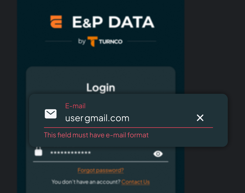
One additional suggestion is to use forgiving formatting. This is especially useful when we need users to input numerical information, such as a phone number with area codes and even country codes. By using this type of formatting, we become flexible and make our information easy to scan, and thus easier to detect errors. We let users type the information as they have it, and then reformat it to include dashes and brackets that simplify reading that number.
How to address mistakes?
Users set out to achieve a goal with our digital product, and based on their mental model of the system create an action plan that will lead them there and later assess its results. According to Don Norman in his book The Design of Everyday Things, users go through the Gulf of Execution (“How do I use this tool to reach my goals?”), and will later go through the Gulf of Evaluation (“Did this tool work how I wanted it to?”)
Many user mistakes are the result of not getting enough help to bridge those two gulfs. Users either devise a plan that is incorrect, or can’t fully grasp how the state of the system changed as a result of the actions they’ve taken.
To address user mistakes, it’s paramount to be extremely familiar with the mental models of users, and adapt our product to it. This requires us to learn about our users in depth, understanding their mistakes, expectations and overall circumstances ideally before we design our product, but we can also use our prototypes to learn more about our users.
Following Design Conventions is also a way to help our users reduce their mistakes. It uses the knowledge that our users have generated through their interactions with other products to our advantage. Deviating from established conventions can lead our users to err.
Designers should also communicate affordances: using design itself to communicate how our product can be used. For example, adding a drop shadow to a clickable button makes it look like it’s rising from the screen and can be pushed.
Yet another way to reduce mistakes is by previewing results. Users might not realize what they’re about to do, and showing a preview could help them notice the changes they’ll cause. If possible, designers should offer previews that users can examine closely, so that they won’t commit time-consuming mistakes.
Ways to avoid both slips and mistakes
Some error-prevention strategies work for both slips and mistakes. Here are some guidelines to aid your design process:
- Don’t rely too heavily on your user’s memory. This distracts them and sets them up to fail. Remove the need for information that is memorized by users, and prefer to display the information that users need.
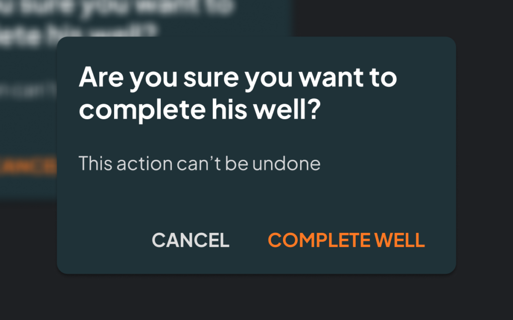
- Ask for confirmation before destructive actions. Deleting an account by mistake can be a catastrophe, so remember to provide your users with confirmation of the step they’re about to take with confirmation dialogues. Bear in mind that confirmation dialogues interrupt the user’s flow, so only use them when it’s really necessary.
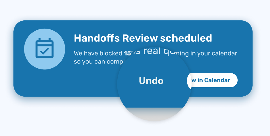
- Include Undo. It acts as a safety net (we’ve covered this here) and speeds up resolution.
- Warn before errors happen. Subtly including error warnings can help users anticipate to an error message and solve the problem beforehand.
Users will always make slips and mistakes, but we can help them reduce their frequency by designing with our users’ usability in mind.
Stay tuned for an exploration of Nielsen’s sixth heuristic: Recognition rather than recall, and discover how to apply it for a great digital product.
At Arionkoder, we help you create innovative products that delight your users. Reach out to us today to discover everything we can accomplish together!