Our digital product design company is committed to creating products that offer exceptional functionality and a seamless user experience. Nielsen’s 10 Heuristics serve as our guide: discover more about them here, and explore heuristic number 8 with us below.
Times Square is an iconic place. Its record-breaking billboards, along with its shiny, always-lit posts and its multitudinous crowds make it a must-visit destination. However, no matter its beauty, it’s also easy to imagine feeling overwhelmed there with the lights, colors, movement and dynamism of the entire situation.
Something similar can happen to our product’s users. By giving superfluous stimuli, we might be either taking their attention away from the main focus, or directly saturating them with negative results. This is why Nielsen’s 8th heuristic explains that:
“Interfaces should not contain information that is irrelevant or rarely needed. Every extra unit of information in an interface competes with the relevant units of information and diminishes their relative visibility.”
Our digital products should be very careful not to overwhelm users. Part of it relates to design, but this is not exclusive: the content we include must also be carefully crafted to the same end. This doesn’t mean that your product can’t have a characteristic look and feel! But it does mean that focus is an important part of your result.
You might have noticed that Nielsen’s heuristic separates two elements: Aesthetics and Minimalism. Are they both really necessary? And how do they impact our results?
Are aesthetics really relevant?
First impressions of everything we interact with are closely related to what we see, and it all happens in less than a second. We judge by our visual findings much faster than by what we can gather through other senses or even what we read, for example. This means that great features and content are not enough to charm a user right away.
As the great Don Norman has said, “Attractive things work better”. Our brains are conditioned to think that just because something is visually pleasing, it’s easier to use -even though both aspects are unrelated-.
It’s also important to consider that aesthetics can help establish a brand, or consolidate its presence. So, in a nutshell, aesthetic aspects are definitely relevant in the creation of valuable digital products.
What about minimalism?
For starters, it’s important to remember that minimalism in this context doesn’t refer to the design trend but rather the philosophy behind it. Minimal design limits the amount of noise – irrelevant information – and focuses on key information that brings value to users: it removes unnecessary elements that don’t help users reach their goals.
It also includes all necessary elements to help them reach said goals: a design with too many elements confuses users because of overabundance of information, while a design with too few elements harms usability. Minimalist visual design (in its trendiest sense) sometimes fails to apply this heuristic correctly, while other types of design can apply it by analyzing the elements they include.
Tips for aesthetic and minimalist design
- Limit the noise and maximize the signal.
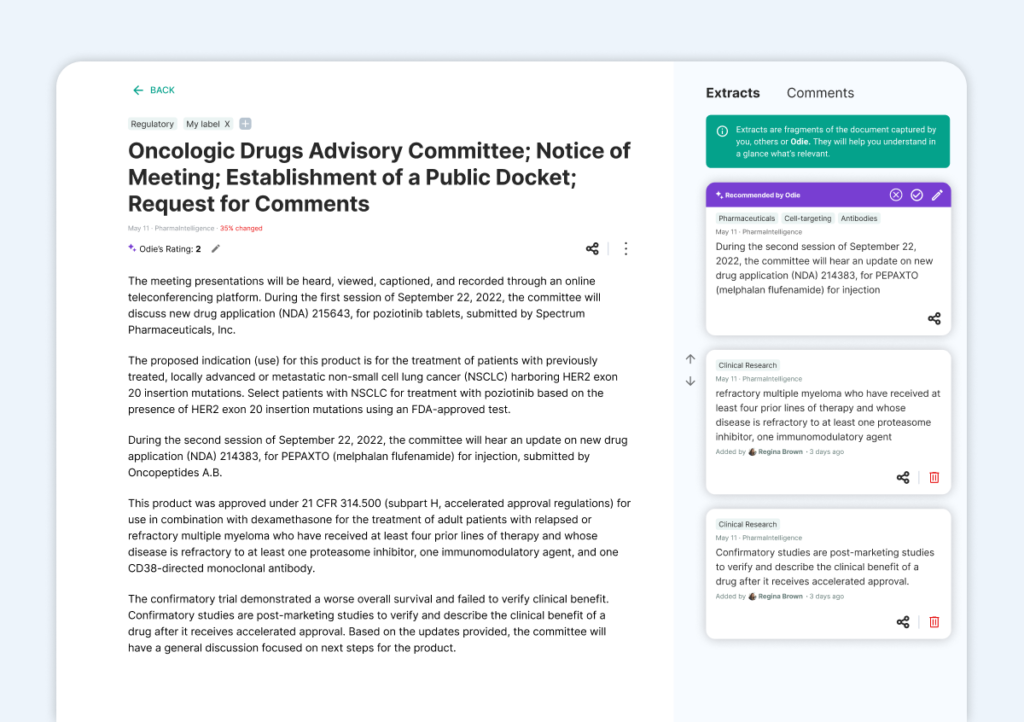
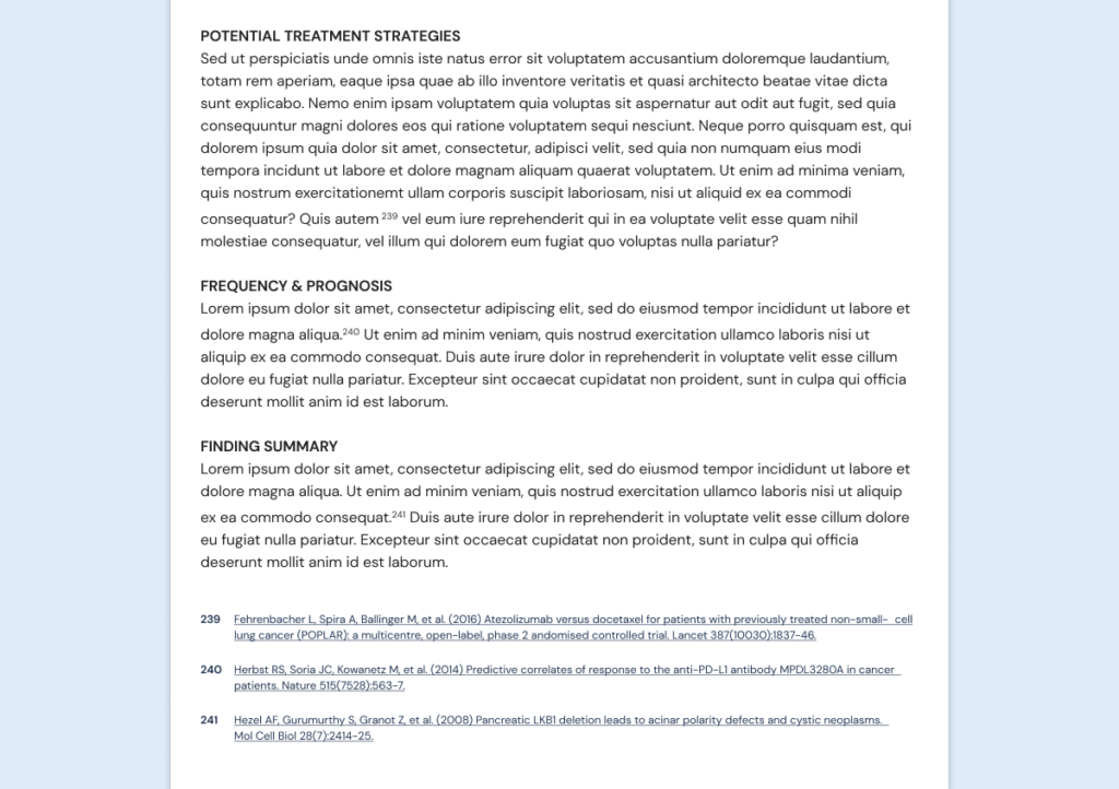
By eliminating irrelevant information and stimuli, we prioritize signals -relevant data for the user-. Some examples of nouse are cluttered images, technical teams unaccompanied by explanations and anything we’re just using for decorative purposes. Examples of signals include plain language, high-resolution images and helper texts.
Tip: avoid multipurpose visual clues (the same treatment for different things, such as clickable and unclickable links).
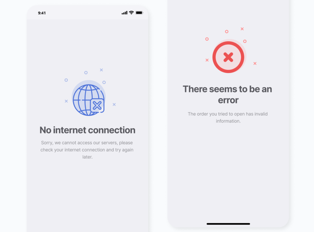
Let’s see some examples from our work to discover how to apply this tip:


- Leverage universal visual patterns with positive connotations.
Joyful visuals that make users smile can be important to create aesthetic design, and positive connotations are mostly universal. For example, a baby’s face makes people smile regardless of their culture of origin. - Accept that we can’t satisfy everyone’s expectations all the time.
Information that is relevant to one audience might be irrelevant to other. To confront this, make sure you know your personas very well and design for them. This is especially important when we’re designing global products, where we need to cater to very diverse audiences.
You shouldn’t judge a book by its cover, but there’s a reason covers are attractive. Aesthetics play a big part in first impressions and we should leverage them, while conveying the right elements that will help our users achieve their goals.
Stay tuned for an exploration of Nielsen’s ninth heuristic: Help users recognize, diagnose, and recover from errors.
At Arionkoder, we help you create innovative products that delight your users. Reach out to us today to discover everything we can accomplish together!
