Picture this: You download a new app, all pumped up to explore its features. But within minutes, you’re bogged down by a never-ending sign-up process and confusing menus. Sound familiar? That’s where user onboarding comes into play. The very first experience with a product will have a lasting impact on the user. From the first touchpoint of acquiring a prospect, throughout the setup and discovering the real value the product has for the user’s goals, the user navigates a journey that should be very intentional and carefully crafted to achieve engagement.
First impressions count
The opportunity to engage and delight users starts at the get-go. In this window of time, you need to grab their attention right off the bat and show them how your product can solve their problem. The more you understand your audience, the better you can tailor your pitch to resonate with them.
Look at Headway, for instance. They’re all about condensing key ideas from the world’s nonfiction bestsellers into bite-sized insights. How do they reel in users? By hitting them up on social media and empathically tapping into their desire to be productive and learn something new. Their team understands who their target audience is and delivers the right message at the right time.
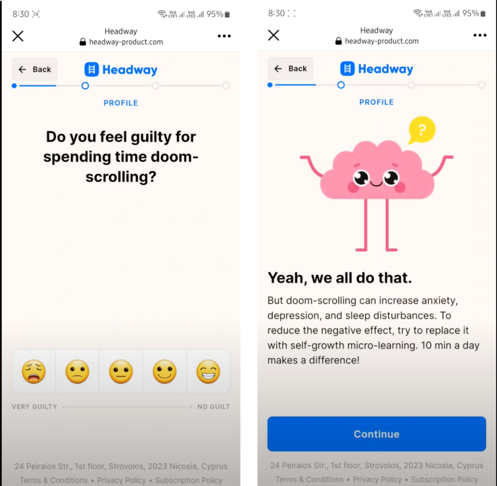
A Value-First Approach
Once users sign up, they want results fast, as well as quickly understanding how the product works. The expectations are high after a referral from a friend, or a good download campaign to acquire them.
Enhancing the user’s early experience to emphasize real value should be a top priority. Long sign-up forms and boring tutorials? We don’t want to create unnecessary friction today. You’ve got to get straight to the good stuff and show users what they’re getting out of the deal.
Take Wise, the international money transfer app. They break down all the need-to-know info into five easy steps (maybe too much, IMHO). And then, on the last screen, they let users check out their rates (one of their strongest product differentiators) without even signing in. Right down to business!
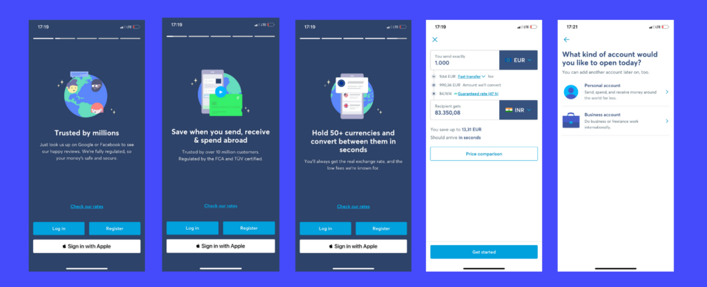
Once users recognize the value, it’s the opportune time to proceed with the full registration process, which may involve requesting personal details and other necessary steps. But they’re already hooked.
Progressive disclosure: Distributing the friction
Setting up an account shouldn’t feel like pulling teeth, especially for products with lengthy “Know-your-Customer” setups which requires scanning your ID and taking selfies to validate your identity. High-friction steps can be deferred until they’re absolutely necessary.
Look at Wise, again. They let the user perform certain initial actions, while blocking other complex features that require extra documentation or validate several information inputs.
The way information is grouped also changes the user’s perception. A common misconception about onboardings is that we need fewer screens to make it quick and straightforward, but actually it’s the information cluttering and overload that creates the undesired effect. Breaking a long form into multiple screens is even better to focus the cognition efforts on one input at a time.
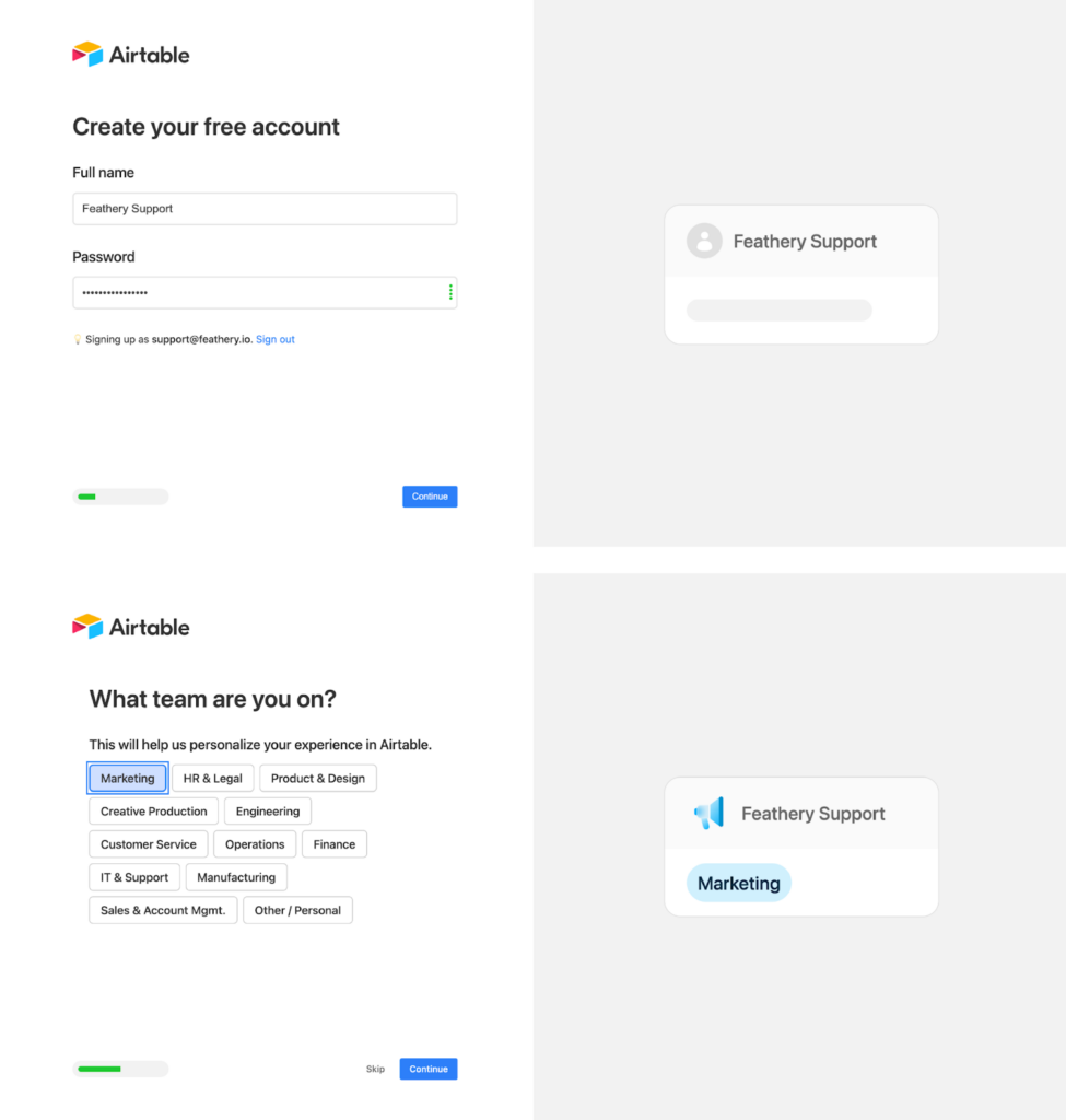
Check out Airtable—they guide the user from setting their name and password, to collecting important information and segmenting their users through multiple steps, keeping the focus on one thing at a time.
Beyond Tutorials: Onboarding as a Discovery Journey
Traditional onboarding often relies on tooltips and illustrations to introduce product features, but “learn-by-doing” tutorials can be particularly impactful, especially for certain types of products.
These interactive experiences don’t just show users what to do; they guide them through the actions, helping solidify understanding from the start.
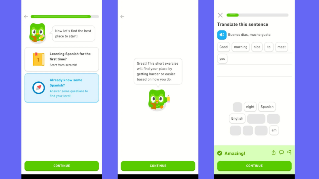
For example, Duolingo uses an interactive test to assess your language skills while simultaneously introducing the app’s mechanics, engaging you immediately in the learning process.
Effective onboarding also encompasses sales demos, follow-up emails, and customer outreach—all designed to reinforce the product’s value and seamlessly integrate it into the user’s daily routine. This comprehensive approach helps ensure users transition smoothly from newcomers to proficient, engaged users.
Fast and slow: Balancing the friction
Friction isn’t always a bad thing. Sometimes, slowing down helps users focus and give accurate information, or discover a key feature. It also weeds out low-quality users that might not be your target, especially when it comes to security and compliance areas. But finding the right balance is key. It’s all about knowing your product, your users, and what makes them tick.
A great example of good friction is when you need to personalize the onboarding for a richer user experience. Input from the user is crucial to truly show them the value of our solution.
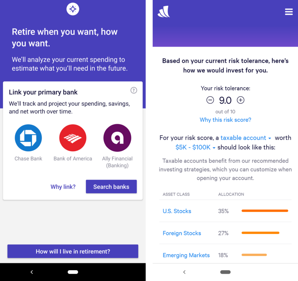
Wellfront will ask you to link the bank account to analyze your financial status and provide a glimpse of your investment plan. Asking to look into your account is a bold decision, but the rewards are also high. Finding the right balance on how much friction is needed depends on the type of product, the user segment and the strategy. A/B experiments, unmoderated user tests and a clear set of success metrics will help fine-tune and discover the correct balance for you.
To wrap up
User onboarding isn’t just about walking new users through a set of features—it’s about setting the stage for how they perceive and interact with your product long-term. From making a strong first impression to ensuring the product’s value is front and center from the get-go, each step of the onboarding process is a crucial piece of the puzzle in building lasting engagement.
By adopting a thoughtful approach to onboarding—highlighting value early on, using progressive disclosure wisely, and balancing the necessary friction—we pave the way for users to not only see but feel the impact of the product in their lives. Remember, the true measure of successful onboarding is not just in getting users to start, but in getting them to stay.
Questions? Reach out to us at [email protected] for a free consultation and let’s explore how to make your products stand out from the crowd!
