
When discussing UX principles and laws, we often encounter challenges in providing clear visual examples to complement written explanations. Visual representation plays a crucial role in understanding these principles, and it’s where we can easily perceive their impact. In this article, I’ll focus on how UX principles manifest in UI design.
Before we start with that, I’ll shortly walk you through the story of where all the Gestalt topics started. Let’s travel to Germany, where Max Wertheimer, a Czech physiologist who studied at the Institute for Social Research at Frankfurt University, conducted a series of experiments to explore how our minds perceive motion.
The experiment consisted of two bars of light that alternated back and forth under specific conditions, which made people feel like there was movement between them, even though nothing was physically moving. This phenomenon is called “phi motion,” where our perception creates motion without any actual object shifting.
Wertheimer’s groundbreaking work, published in 1912, laid the foundation for Gestalt psychology. In summary, this study reveals how our brains organize visual information, a key concept in understanding how we perceive the world around us. In 1920, with the help of Kurt Koffka and Wolfgang Kohler, the Gestalt Principles were created. They identified a set of laws that address the natural compulsion to find order in disorder.
Interestingly, the term “Gestalt” originates from the German language, where it means “shape” or “figure.” Some may even refer to it as “structure.” This concept captures how our perception organizes and connects smaller visual components (figures) into a cohesive and meaningful whole (structure).
You might wonder what this has to do with design, but it actually has a lot to do with it! According to the Gestalt Principles, the mind “informs” what the eye sees by perceiving a series of individual elements as a whole. My intent with this article is to guide you through the 6 basic Gestalt Principles and how these principles are applied in the user interfaces of many digital products we use daily.
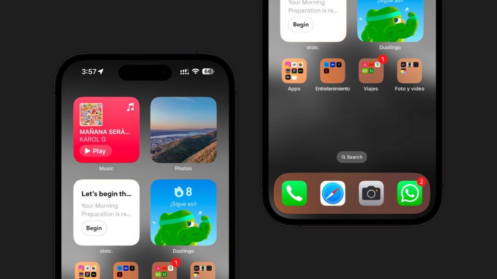
Grouping components by similarity makes the interface cohesive (Similarity)
Look-alike figures are usually grouped together, while those that look different are perceived as separated. This is what we call the principle of similarity: it can be distinguished by color, shape, size or texture.
I’ll walk you through some examples:

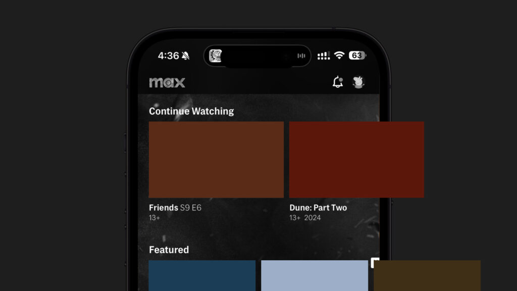
Proximity between components makes them relatable (Proximity)
The principle of proximity is where components that are at a close distance are usually perceived as a group or as if they are part of the same. This law is very useful for organizing and grouping components effectively.

Components that look similar are often proximate to one another. The principles of similarity and proximity work really well together. In user interfaces, you will often see both applied at the same time.
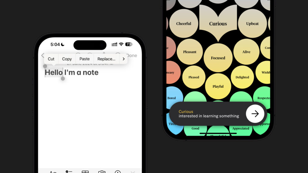
Components that are arranged on a line are relatable (Continuity)
According to the principle of continuity, our minds tend to follow a pattern even if it is not entirely visible. This can be seen in elements that are arranged next to each other.


Partial components influence user perception (Closure)
Our brains naturally complete incomplete shapes or patterns. This means that whenever we see an incomplete element in an interface, our minds fill in the blanks to perceive the whole element. This is what we call the principle of closure.

This same principle can be applied in vertical listed elements in UI design.
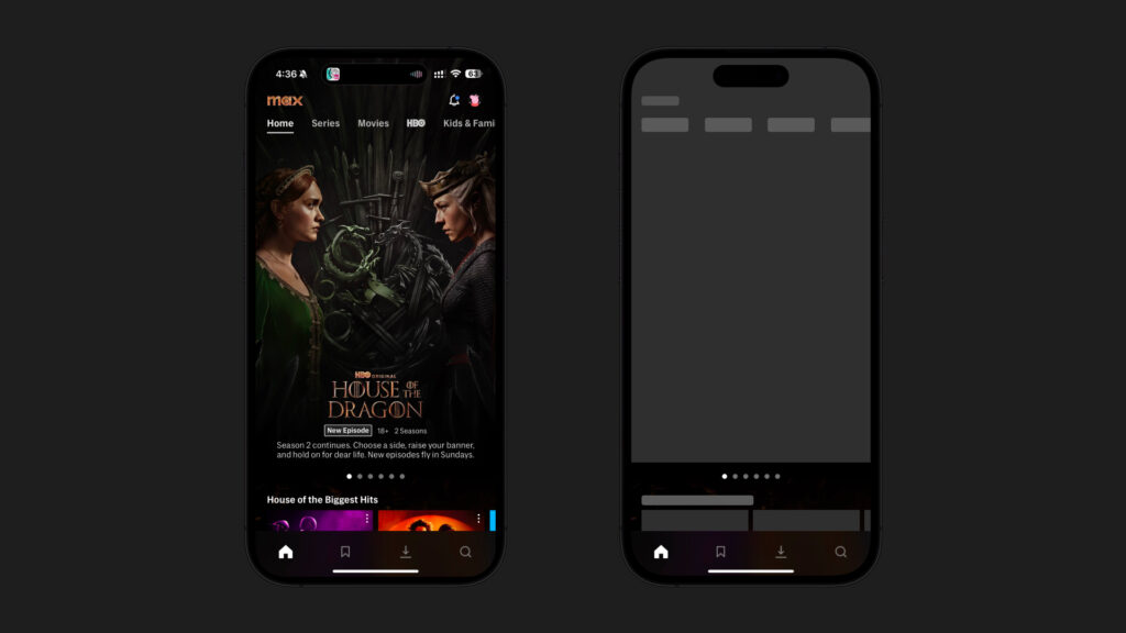
Layered components create a visual hierarchy (Figure/ground)
We naturally categorize elements as either being in the front (foreground) or behind (background). In interfaces, we can mainly notice this on modals, drawers, pop-ups, action-sheets, and floating buttons.
From complex interfaces to simple shapes (Pragnanz/Law of simplicity)
Our minds try to find simplicity in complex scenarios/layouts. This prevents us from getting overwhelmed by information. In other words, our minds remove distractions and focus on the general shape of components.
This principle is very useful when designing or redesigning a digital interface, as well as gathering quick feedback.
Wrapping up
The Gestalt principles are key to understanding how we perceive components in digital products and how they are organized in our minds. These principles work as tools for designers, allowing us to create digital interfaces that assure expected experiences improving usability and aesthetics.
We can help you create products that wow your users and deliver permanent value! Reach out to us at [email protected] to explore the endless possibilities.