
What is color blindness?
Color blindness, a condition that alters the perception of colors, is not just a singular disability but actually it becomes a series of challenges that affect the visual experience in user interface design. In this article we’ll explore how color vision deficiency affects user interface design, a field where color plays a crucial role in functionality and aesthetics.
In plain words, color blindness is a condition where a person’s vision is compromised and they can’t see colors as they are, finding it difficult to differentiate one color from another. This mostly occurs between red and green colors. An interesting example of this is Facebook’s choice of blue as its primary accent color: Mark Zuckerberg, who is red-green colorblind, sees blue more clearly. This underscores the significance of considering color accessibility when designing user interfaces.
A deeper understanding of color blindness
Before we jump into user experience and user interface conversations it is important to understand why color blindness is caused. This condition arises from anomalies in the cone cells of the retina, which are responsible for color detection. Our eyes are home to millions of these cone cells, each type perceiving different wavelengths of light corresponding to blue, green, or red. When these cells malfunction or are absent, color vision is compromised.
The retina’s short-wavelength cones are sensitive to blue, medium-wavelength cones to green, and long-wavelength cones to red. Our brain interprets color by processing signals from these cones. When this process is disrupted, so is our color perception.

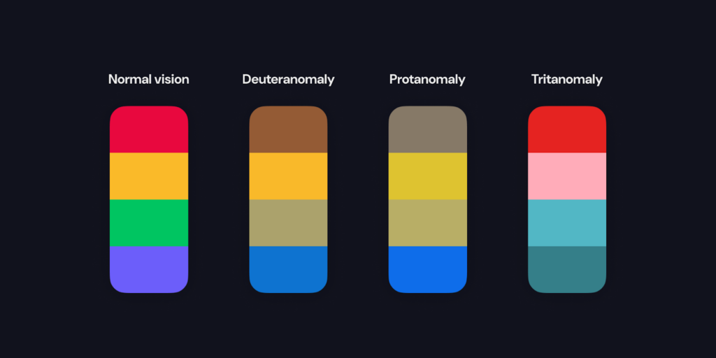
There are several forms of color vision deficiency, but these three are the most common, each affecting the perception of a different color:
- Deuteranomaly, the most prevalent form, hinders the correct perception of green, often causing it to appear red.
- Protanomaly, less common, leads to red being perceived as green.
- The rarest form, Tritanomaly, affects the perception of blue.
As we talk about user experience and user interface, it’s crucial to recognize the impact of color blindness. It’s not merely a design consideration but a gateway to accessibility, ensuring that digital environments are accessible to all.
Color blindness is more common than you know
While color blindness doesn’t affect everyone, a significant number of people live with this condition. Approximately 1 in every 12 men and 1 in every 200 women have some form of color blindness. Considering the global population in 2022 (7.95 billion), we can estimate that around 333 million men have some form of color blindness. Moreover, with over two-thirds of the world’s population having access to phones, we can estimate that 222 million of these men have interacted with digital interfaces. When we include women, the total number of people with some level of color blindness using digital interfaces reaches 235 million.
Color blindness is a condition without a cure, therefore the importance of enhancing digital accessibility for individuals with vision disabilities. Think for a minute about these scenarios:
- Traffic Lights: The standard red, yellow, and green signals rely on color differentiation. However, for someone with color vision deficiency, distinguishing between these hues can be difficult, so they must rely on order and position instead of color.
- Maps and Charts: Interpreting color-coded maps, graphs, and charts can be very complicated. What appears clear to most may be confusing for someone with color vision deficiency. In some cases differentiating data trends can be challenging.
- Electronic Devices: User interfaces on phones, and computers rely heavily on color cues. From app icons to navigation buttons, color-blind users encounter usability challenges.
What appears ‘normal’ based on color recognition can vary significantly for individuals with color blindness. As designers, we can prioritize accessible design to ensure that digital products are usable for everyone, regardless of their ability to perceive colors.
Design resources to improve accessibility
While colors play an important role in communication, relying solely on them in user interfaces can be problematic. That’s why text remains the most reliable means of conveying messages.
Consider the following components to improve accessibility:
Text: In UI design, text serves as the primary communication channel. It ensures clarity and accessibility for all users, regardless of color perception.
Icons: Beyond color adjustments, incorporating universally recognized icons improves interface communication. Icons transcend language barriers and provide additional context to interfaces.
Complementary components: Colors should enhance messages rather than carry them entirely. Relying solely on color can exclude individuals with color blindness. When this occurs include other components such as icons, illustrations, or images.
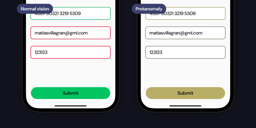
We are so used to seeing the world with regular visibility conditions that we forget that there’s more beyond our own view.
Look at the form below, without any visual complements it would be hard for a user with color blindness to understand what is going on, could the user tell if there is an error there?
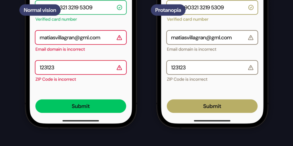
Now look at the same scenario optimized with visual complements and see the difference between an accessible user interface and one that is not.
What about color contrast?
Low contrast in design elements can hinder the ability of users to distinguish content, making navigation and comprehension challenging. Therefore, it’s important to ensure that all components of a user interface are easily perceivable and function as intended.
Achieving this requires adherence to established contrast ratios, which serve as benchmarks for evaluating the legibility of text and the visibility of graphical components. By targeting these minimum contrast values, designers can enhance the color contrast of their interfaces, thereby improving accessibility for users with visual difficulties. This approach not only benefits users with specific needs but also creates a better user experience for all.
Color blindness in digital interfaces beyond apps
In recent years, the gaming industry has recognized the significance of color blindness and its impact on player experiences. Designers and developers now prioritize accessibility not only during game onboarding but also within the settings menu—a crucial aspect of accessible and truly inclusive design. The most common of these accessibility options are:
1. Custom Color Schemes: Games now allow players to adjust color schemes based on their specific type of color blindness. For instance, altering red-green contrasts or using alternative color palettes ensures that critical game elements remain discernible.
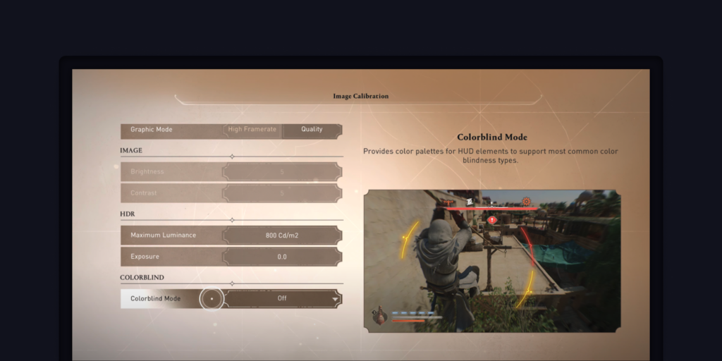
2. High contrast colors: To accommodate users with low visibility conditions, developers incorporate high contrast fill or border colors. These cues enhance visibility, especially when distinguishing between game elements or UI components.

Tools we can use to tackle color blindness in user interface design
Fortunately, we’ve got help to make interfaces accessible to all. Some of these amazing tools are available for free and have singular features that make each of them great, but my favorite when designing interfaces on Figma are the following:
- Adee Comprehensive Accessibility Tool | Figma. Adee is a comprehensive and powerful accessibility testing tool. You can test color contrast and apply changes, simulate 8 color blind simulations and generate them.
- UI Color Palette | Figma. UI Color Palette is a Figma and FigJam plugin that creates consistent and accessible color palettes specifically for UI.
- Able – Friction free accessibility | Figma. Add color contrast and color blindness to your workflow with as little effort as possible.
- Colour Contrast Checker. A tool that lets you check the contrast between different color combinations against WCAG standards.
Good design is accessible. Let’s strive to create a user experience that everyone can enjoy, regardless of how they see.
Leveraging Color Blindness Insights for Clearer Interfaces
Understanding color blindness is not just about recognizing the challenges it presents; it’s about applying this knowledge to create user interfaces that are clear to all.
Apply the following insights during your design process:
- Consider color blindness from the outset of the design process, not as a “nice to have”. Make sure to use color thoughtfully and always provide alternative ways to convey information.
- Incorporate user testing with participants who have color vision deficiencies. Their feedback is invaluable in identifying potential issues and areas for improvement, this valuable input helps refine the interface to serve all users effectively.
- Envision accessibility as a journey, not a destination. As technology evolves, so do the tools and methods to enhance accessibility. Stay informed about the latest developments and be willing to adapt and improve your designs continually.
By applying these insights, we can transform our understanding of color blindness into actionable steps that lead to more accessible interfaces, making the digital world more welcoming to all.
Sources:
https://www.aao.org/eye-health/diseases/what-is-color-blindness
https://www.colour-blindness.com/general/how-it-works-science/
https://www.webmd.com/eye-health/color-blindness
https://enchroma.com/blogs/beyond-color/how-color-blind-see